
Sertifi
Sertifi Signatures allows fast, secure signing by capturing in-person electronic signatures on mobile devices, eliminating paper and manual delays. It includes reusable templates, automated reminders, shared document libraries, and real-time collaboration to improve workflow.
In my role as Lead UX Designer, I defined the end-to-end UX strategy for Sertifi’s NextGen e-signature experience, collaborating with product owners, engineering, content, marketing, and executive stakeholders. I led user-centered design efforts throughout discovery and delivery – research, ecosystem and journey mapping, rapid prototyping, and usability testing – ensuring the platform would enable real-world in-person signing scenarios quickly, clearly, and compliantly.
Tools Used:
Sketching, Photoshop, Figma, FigJam, Canva, Maze, Cursor
Team Size - 10+
2019 - 2020
Role - UX Lead
What is the problem we are trying to solve and what are we designing?
The discovery stage was to investigate the area of friction faced by the signers when completing eSignatures and payment on the Sertifi platform. In doing so I compiled existing research, product data, and feedback from stakeholders to decide the core problem space of the project, and then brainstorm and explore solutions. Common ones were unclear information architecture, fragmented signing and payment steps, lack of visibility into status and next actions — especially on mobile.
These findings gave rise to how I described a focused research strategy, which employed heuristic evaluation, usability testing, and funnel analysis to validate assumptions and prioritize opportunities. This work produced a precise specification of the problem and laid out the basis for iterative design and testing aligned with user needs and business goals.
What are the systems, channels and touchpoints involved?
This ecosystem documents how a signer completes a full cycle of digital agreements from start to finish, including both signing and payment. Senders, internal teams and document templates provide inputs that determine what the signer should do, and the platform leads the signer through reviewing, clarifying, signing and submitting payment in one flow. Behind the scenes, connected systems update records and confirm completion, allowing the signer to finish confidently with minimal friction.
What are the steps the signer has to take?
This journey map shows the process of a signer from receiving an invitation to finalizing a digital agreement and payment. It starts with trust and clarity — being able to see the sender and feel confident opening the document — then transitions to targeted review and guided signing. Clear cues, visible security signals, and simple next steps reduce friction once the signer does the needed things. The journey ends with immediate confirmation and receipt, reinforcing confidence that the process is complete and the agreement was handled securely.
Who are the people we are designing for?
To understand how digital agreement workflows support both speed and confidence, we focused on two key roles within the signing experience: the sender and the signer. These personas represent the distinct motivations, pressures, and expectations on each side of the transaction, highlighting how design decisions must balance efficiency for the sender with clarity and trust for the signer.
What is the signer experience flow look like?
This user flow demonstrates how a signer progresses from receiving a document to signing and payment in a clear, guided sequence. This is where entry communications come in, establishing the expectations and guiding a user through the document, in which required actions are highlighted to reduce hesitation. Inline editing lets you clarify without losing focus, and steps to sign the page are laid out so that they don’t feel forced. The flow ends with a streamlined payment step, solidifying completion and confidence when all required actions are finished.
What are some main elements featured?
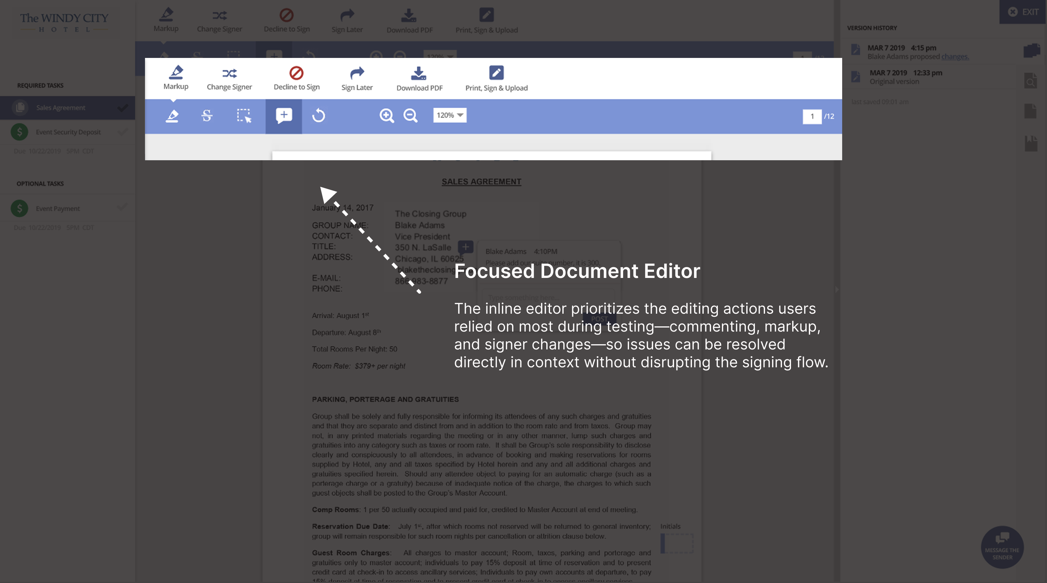
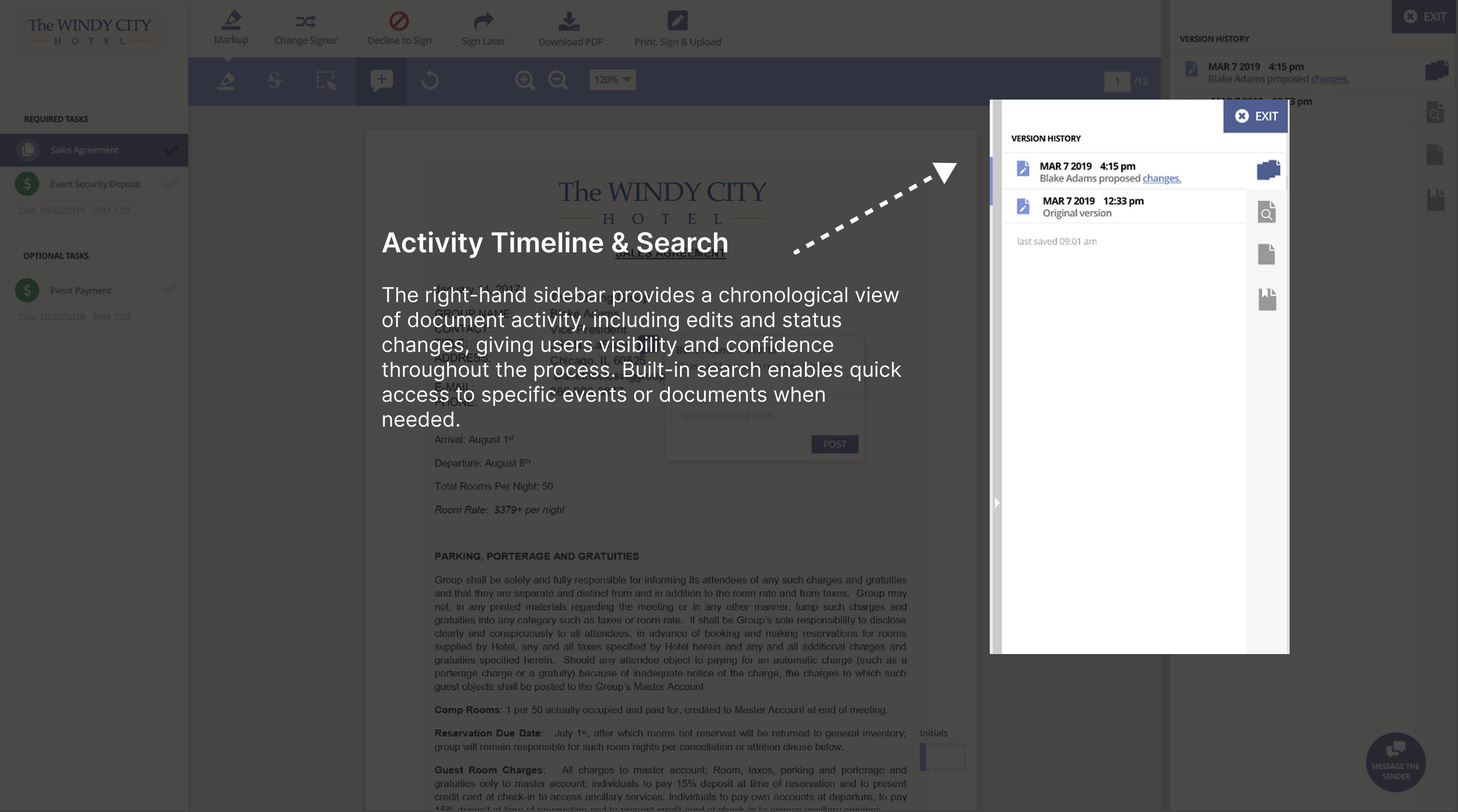
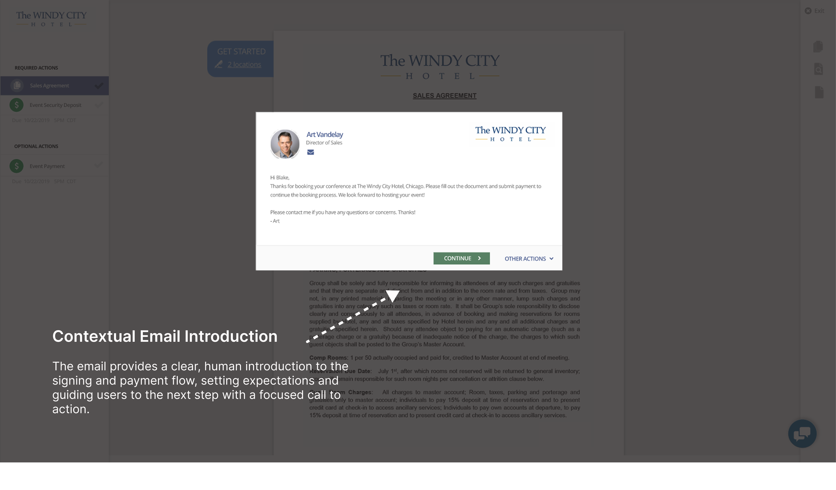
The experience reduces friction in the signing and payment flow by keeping users oriented, informed, engaged, and moving forward. A contextual email sets clear expectations, the left-hand progress panel clarifies required and optional actions, and the focused editor supports key tasks without disrupting momentum. An activity timeline adds transparency and confidence by surfacing edits and status changes, creating a clear, streamlined path to completion.
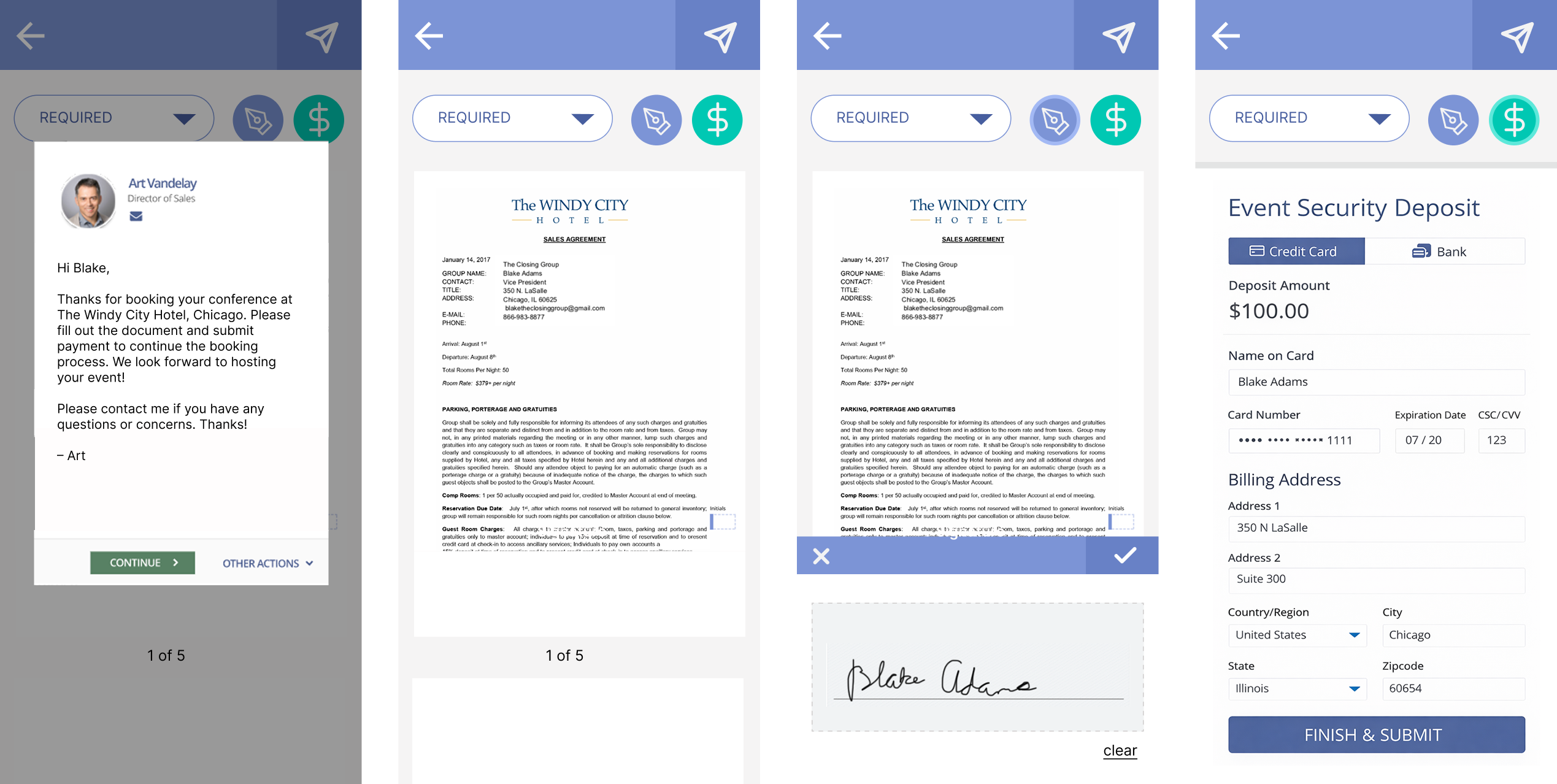
What does the experience look like in mobile?
The mobile experience guides users through reviewing documents, signing, and submitting payment in a clear, step-by-step flow. Content is optimized for small screens with focused views, visible progress, and clear primary actions, allowing users to complete required tasks confidently without switching to desktop.
What do end users think?
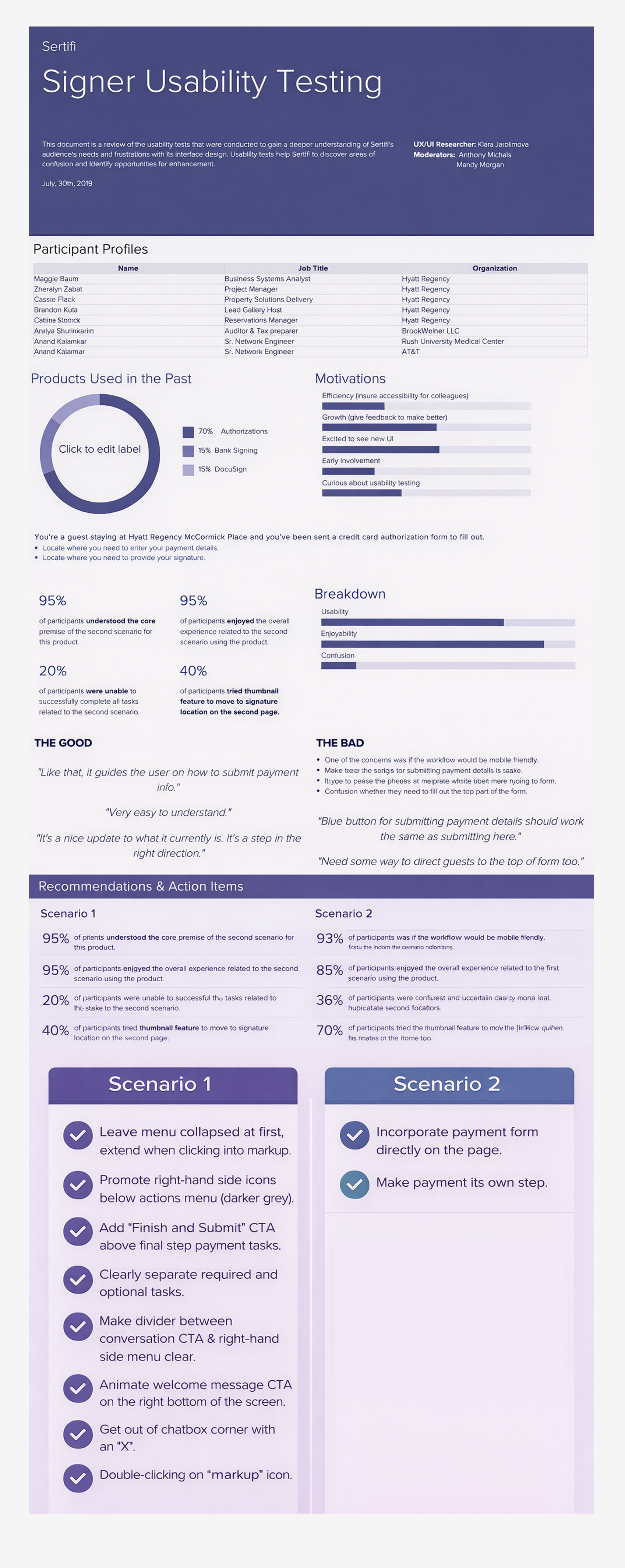
The usability study assessed the signer experience of Sertifi’s eSignature and payment flows based on clarity, confidence, and task completion. The study was conducted in July 2019 on a static prototype, with eight participants across hospitality, healthcare, finance, and enterprise technology. Results indicated good overall comprehension and satisfaction. The participants found signing, markup, and submission intuitive and found the use of version history helpful in building trust. Still, around the conversation feature, right-hand icon discoverability, and clarity of the final submission step, confusion emerged. Payment field hierarchy, submission behavior, and mobile considerations — some users faced difficulties in the payment flow. Recommendations for targeted design improvements came from the study (for example, clearer separation between required and optional tasks, making “Finish and Submit” the clear final action, better icon visibility, more clearly delineated conversation features, and a more explicit payment placement in the signing flow).
Key Takeaways
"I had the pleasure of working with Klara at Sertifi. As our first UX designer, Klara consistently came up with innovative solutions on how to improve our products - not only from a visual perspective, but taking into consideration the workflows that our users would benefit from. She was outstanding at interfacing with clients and conducting usability testing to find the best solutions for the right group of people. Klara forced us to change our ways of thinking and consider solutions that were outside of the box we were used to working in. I can't recommend Klara enough - her ability to quickly turnaround working prototypes or mockups was unparalleled. She did a fantastic job incorporating feedback from stakeholders and end users to create the best design and solutions. When you work with Klara, you can expect hard work, an inquisitive mind, an ability to empathize with users' pain points and a solution-oriented problem solver.
-
Early collaboration with end users, supported by usability testing, strengthened evidence-based design decisions and deepened understanding of user needs.
-
Reduced signer friction, leading to smoother completion and fewer drop-offs.
-
Improved cross-team alignment, enabling faster, evidence-based decisions.