
MyElkay
An order inquiry online tool for Elkay's reps.
myELKAY is an internal-facing portal that supports order inquiries for Elkay sales representatives. As one of the first projects at Elkay, it introduced UXPin as a collaborative prototyping tool, enabling rapid iteration and continuous feedback across design and development. This approach strengthened cross-functional collaboration and accelerated alignment on layout and interaction decisions.
The primary challenge was designing a clear, step-by-step experience that enabled users to efficiently search for orders and review results using robust, scalable search functionality. The application needed to support core workflows centered on locating, filtering, and managing large volumes of order data. Some of the main activities for the app's users to complete while using MyElkay were:
- Search, locate, and access order details — including filtering, status lookup, and downloading sales order acknowledgments.
- Find and manage invoices — retrieving current and historical invoices for review and download.
- Configure and manage user access — administering individual and group account roles, permissions, and profiles.
After the launch of the product, we handed out a survey in which 91% of users were pleased with the redesign and considered the tool extremely user-friendly.
Tools Used:
Sketching Board, Photoshop, UXPin, Optimal Workshop, Bootstrap
What are the systems, channels and touchpoints involved?
The myELKAY ecosystem supports a continuous order management journey, centralizing fragmented systems into a single portal that enables sales and support reps to maintain visibility, ownership, and customer trust across the entire order lifecycle.
Who are the people we are designing for?
The myELKAY Order Management Portal is a management interface for operations, procurement, and customer support teams who handle large volumes of orders, invoices, and account activity across multiple projects and stakeholders. Such users must juggle tight timelines, budget accountability, and frequent internal and customer inquiries—often while working across multiple systems and data sources. It requires fast, reliable access to order status, billing, shipping, documentation, clear, consolidated views, and reduced back-and-forth communication. The experience prioritizes speed, clarity, and accuracy, enabling teams to confidently answer questions, resolve issues quickly, and keep operations moving without disruption.
Figuring out information architecture.
Card sorting informed these low-fidelity wireframes.
Card sorting was used to validate the information architecture before any screens were designed. By analyzing how users naturally grouped tasks and content, I identified clear, high-agreement categories (Dashboard, Orders, Invoices, Account, Resources, Support) that became the global navigation.
These validated groupings directly informed:
- Page hierarchy and navigation structure
- Search-first, table-driven workflows for Orders and Invoices
- Consolidated order detail views with tabs (billing, shipping, tracking, documents)
Because the IA was already validated, the low-fidelity wireframes focus on structure, flow, and task efficiency rather than visual design—reducing risk before moving into high-fidelity UI and development.
Purpose of Lo-Fi Wireframes?
Collaboration with engineering, and clarity of functional requirements and technical feasibility.
These low-fidelity wireframes were intentionally used as a collaborative working artifact between design, product, and development to validate information architecture, layout logic, and functional requirements across the myELKAY portal. By removing visual styling and brand considerations at this stage, the team was able to focus on technical feasibility, data availability, and task efficiency for key workflows such as login and dashboard access, order search, order details, and supporting resources.
Rapid prototyping and testing of content, and experience prior to user interface visual and brand guidelines.
The simplified layouts enabled rapid usability and A/B testing of navigation structures, content grouping, and interaction patterns, ensuring users could locate information, understand order status, and take action with minimal friction. Feedback from testing and cross-functional reviews informed refinements to navigation, data hierarchy, and flow logic before advancing to high-fidelity, brand-aligned design, reducing rework and aligning early on scalable, buildable solutions.
Usability and A/B Testing
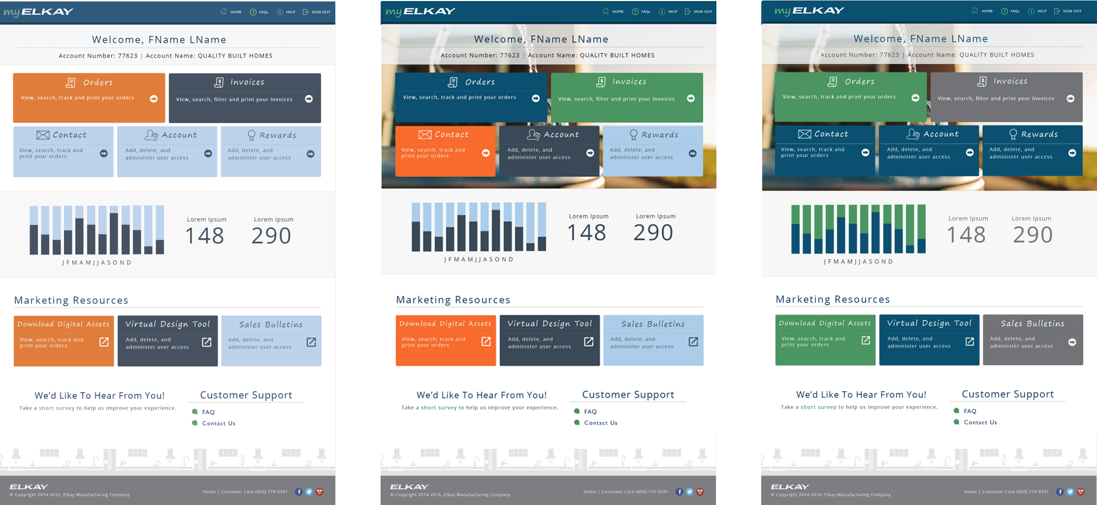
A/B testing to validate the home dashboard IA
Multiple home dashboard layouts were A/B tested to evaluate how users preferred to access core tasks such as Orders, Invoices, Account, and Resources. While testers appreciated seeing detailed order information and customer lookup on earlier dashboard concepts, they consistently viewed this information as secondary.
Testing showed a strong preference for a simpler dashboard with five primary CTAs, allowing users to quickly enter full workflows via navigation rather than processing dense information upfront. The final IA reduced cognitive load by prioritizing clear entry points over detail-heavy summaries.
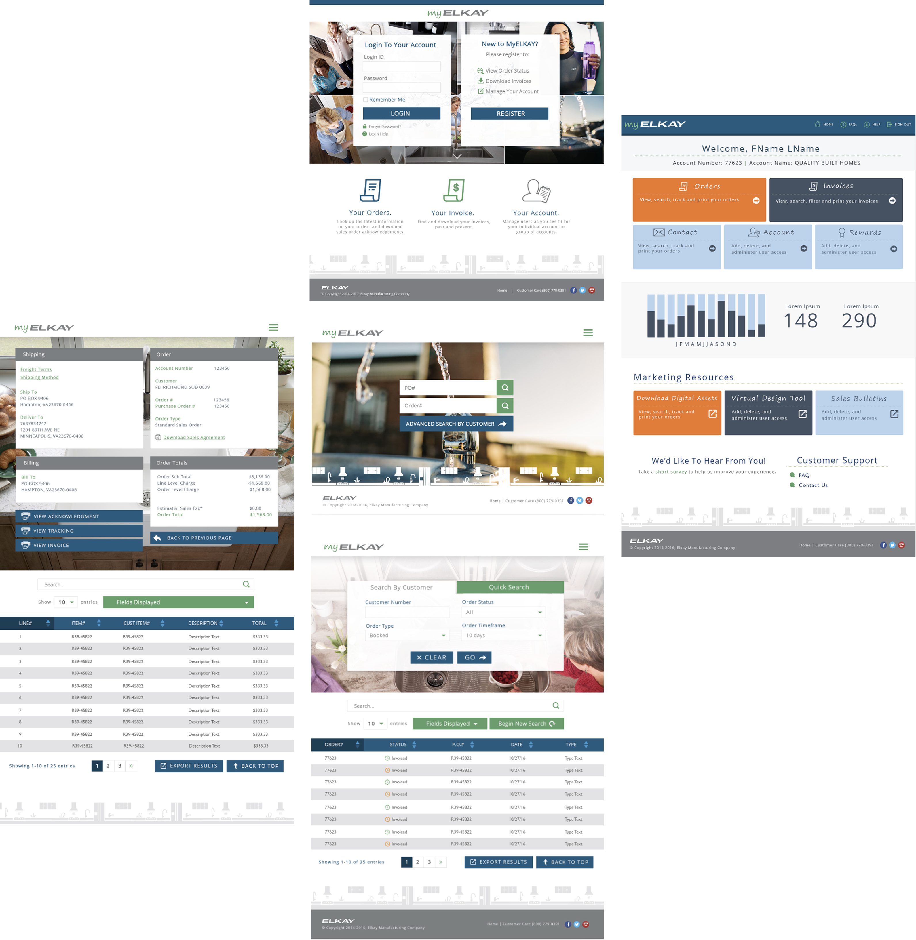
Usability and A/B testing to validate order search experiences.
Multiple search patterns were A/B and usability tested to support efficient order discovery across large datasets. While a progressive search flow was explored for complex queries, usability testing revealed that users consistently preferred quick search and status-based filters as more intuitive and easier to use. Embedding keyword search directly within the order table further improved efficiency by allowing users to refine results without leaving context. The final search experience prioritizes speed and clarity while still supporting scalable order management needs.
- Quick search and status filters were preferred and perceived as more user-friendly than progressive search
- Progressive search supported edge cases but added unnecessary friction for most workflows
- In-table keyword search reduced context switching and improved task efficiency
The tables serve as the primary interaction surface for order management, designed to support fast scanning, comparison, and action across large datasets. Integrated search within the table allows users to quickly filter results by keywords without rerunning queries or leaving context. Key fields such as order number, date, customer, order type, total, and status are displayed by default, with options to adjust visible columns as needed—keeping the experience efficient, flexible, and task-focused.
Visual concept testing within brand guidelines
Various visualizations of the home dashboard were investigated and tested with Elkay’s design system and brand guidelines. The layout and information architecture did not change but differences around visual hierarchy, color emphasis and the way background was used were made to see how the choices influenced scanability and wayfinding.
The testing results indicated that better contrast in colors and a simplified background were user favourite, which allowed primary actions such as Orders and Invoices to be seen at a glance. Heavier visual treatments would express the brand but also add a higher cognitive load -- cementing the choice to focus on design clarity and task orientation versus decoration in the end product.
What is the Hi-fidelity design?
The myELKAY Order Management Portal applies Elkay’s design system to transform complex order and account data into clear, scannable, and action-oriented interfaces, enabling enterprise users to work efficiently while reinforcing trust in the Elkay brand.
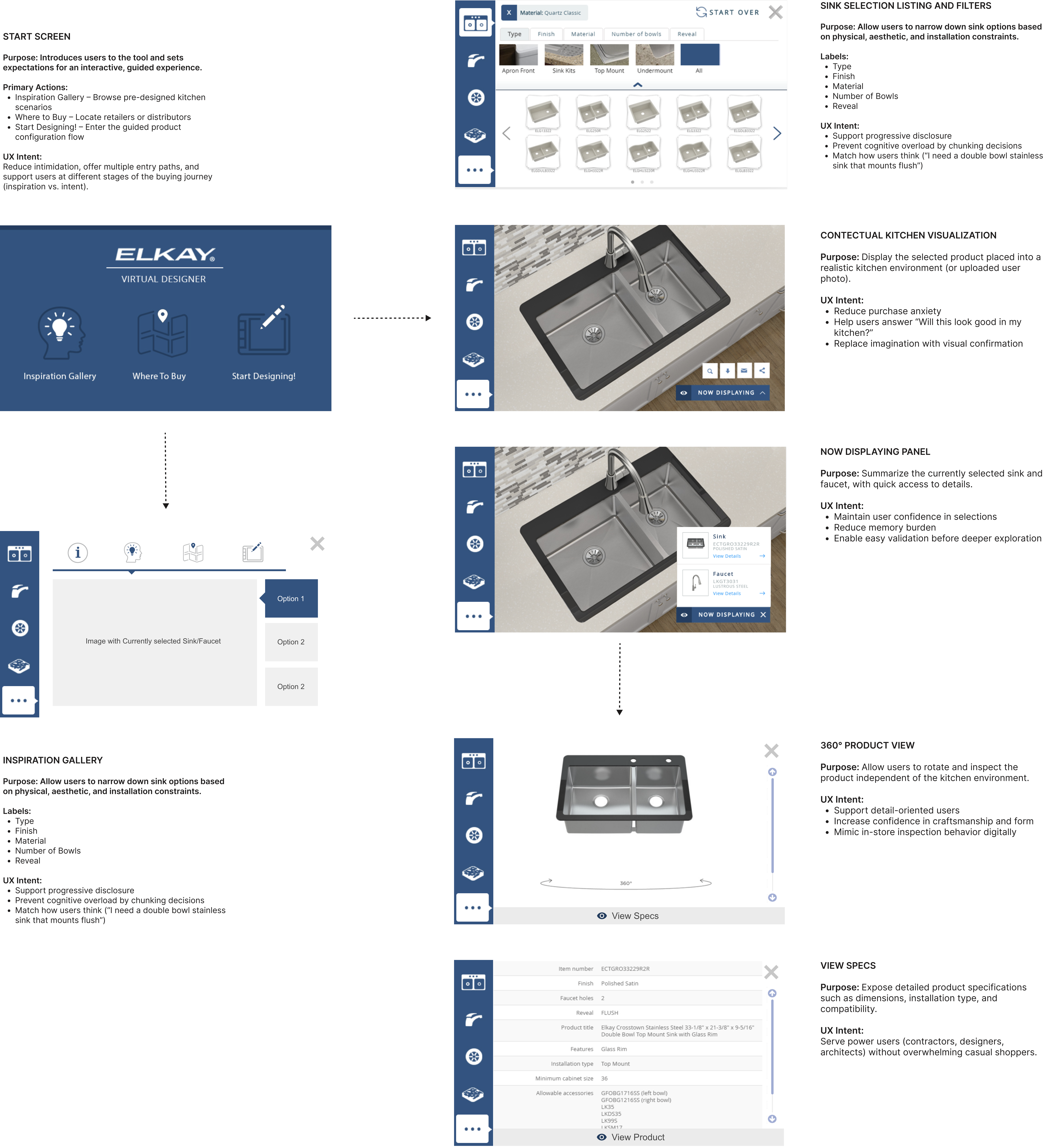
Virtual Designer
The Elkay Virtual Designer is a web-based product configuration and visualization tool that allows customers to explore, customize, and preview sinks and faucets within realistic kitchen environments or their own uploaded photos—helping reduce purchase uncertainty and support confident decision-making without requiring AR hardware.
The Virtual Design Tool was designed as a sales enablement and decision-confidence tool, allowing both Elkay sales representatives and customers to visualize sinks and fixtures in realistic kitchen environments — including the customer’s own space using uploaded photos.
How the Virtual Design Tool supports sales and customers
Rather than relying on static spec sheets or imagination, sales reps could use the tool during conversations to:
- Show how specific products look when installed
- Compare finishes, configurations, and mounting options side by side
- Reduce uncertainty around fit, aesthetics, and compatibility
- Build trust by making abstract product details tangible
This visual context helped move conversations from “Will this work?” to “This is the right choice.”
Key Takeaways
The myELKAY order management redesign addressed the complexity of enterprise workflows by validating the information architecture early and reducing unnecessary cognitive load. User research and testing emphasized the need for clear navigation, predictable entry points, and progressive disclosure of information. The redesigned order listing enabled users to efficiently scan, search, and filter large volumes of orders, supporting quick access to critical details without overwhelming the interface. These improvements resulted in a scalable, task-focused experience that enables faster, more confident order management across customer and internal user roles.
-
91% usability rating confirmed the portal’s effectiveness in supporting complex order workflows.
-
40–60% projected reduction in support calls.
-
Centralized order data reduced system hopping and resolution time.
-
Faster core workflows, less cognitive overhead.
-
Designing for visibility and trust improved rep confidence and customer experience.